I probably will not be able to add any temporary classes (like ttip-conj), only permanent ones. The tip/popup system is SO messy that it is one of those "I fix one thing, I break three others", and I am hesitant to add conditional classes that I'd need to remove elsewhere. Not impossible, just not something I can add in a few minutes.
Understandable. It's just a suggestion you can look into for the future - no pressure at all. Not only for this contest, I think what I'm suggesting is actually a fairly standard way to handle a singleton div like the one you have here.
All it would involve is adding and removing CSS classes at the start of the functions that "show" the div, so each use can be styled independently without touching the rest of the system. It's also something I can test locally by overriding those functions.
Anyway, I should relax with the coding, it's eating up all of my free time :D
PS: You're already doing this with .rhidden (for example).
Update: Wrote a bit of code to try this out, and while it does work, there are certain problems. For example if you have the conjugation table open (gets styled individually) and hover over anything with hooktip() it gets rid of the .class XD
Well, I've been meaning to do it for years, so maybe this is a chance to break out and start to do it. For example, I could design a new tooltip system, and then only use it for the conj panels. Work out the kinks, then slowly replace the old system with it.
I bet there is a lot of css handling that could be done to avoid a ton of the js conditional stuff I have now when sizing the tooltip with regards to sides, viewport, etc.
I'll have a new tip/modal for the conj tables ONLY tomorrow. Gotta start small, and if we can stress test it, I'll move it out to more places. I'm sure I'm forgetting some gotchas, but so far, the code was so much simpler than the ball of duct tape I have at the moment. As in, most likely 5% of the length. Assuming I'm missing a bunch of options and not-yet-implemented options, probably round out at 25% of original length, and more flexible at that (multiple modals, if necessary one day).
Ok, it's up. tipp is the new class, ttitle for the header div, tbody for the body, and the conj modal itself also gets tip_conj added to the .ttip div. No longer has ids (at least, not any at the moment).
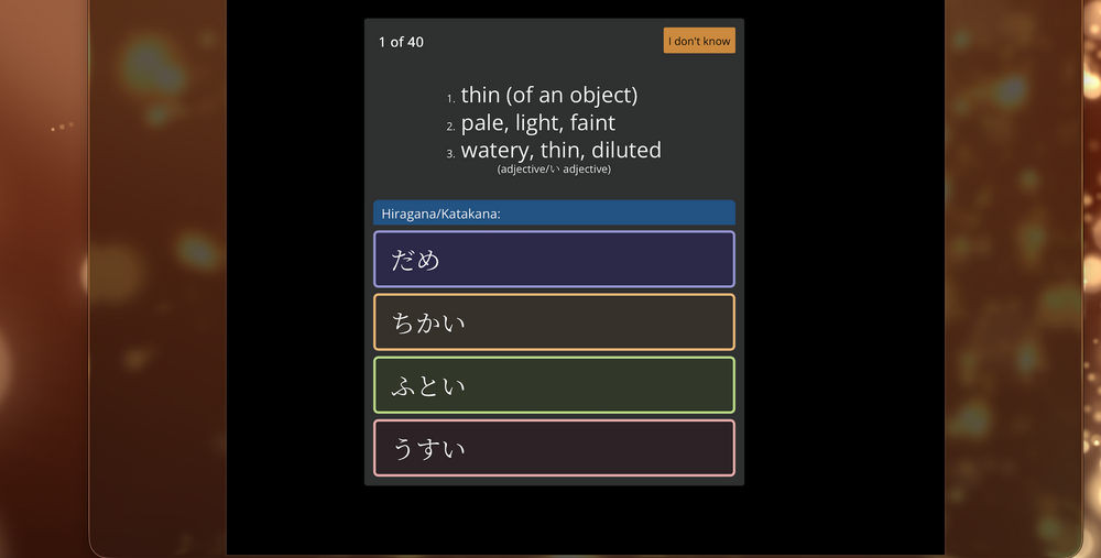
Since @いのしし (on the first page) wanted a timer for quizzes, I made one. It doesn't fit the requirements for the CSS contest (obviously...), but I still made it for fun. Just automatically "hits" the "I don't know" button when the time runs out.
Hi ! im a bit familiar with css, html, python and JS. My coding streak is doomed
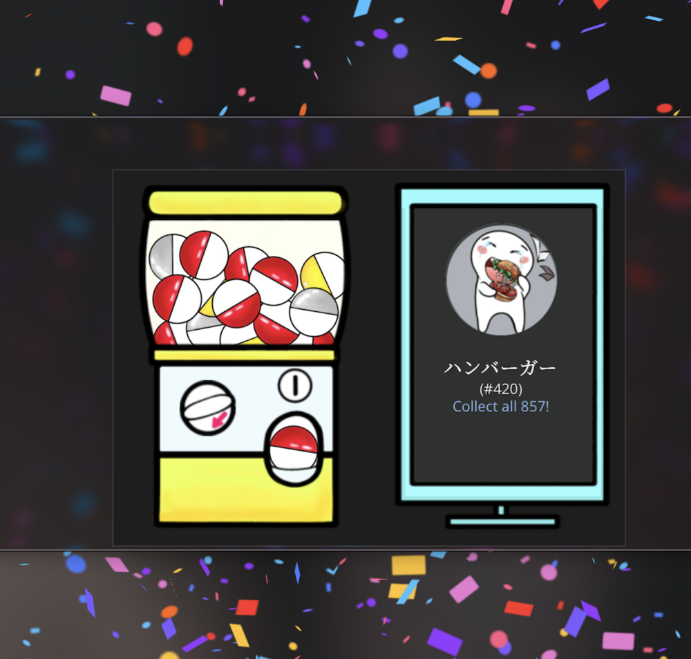
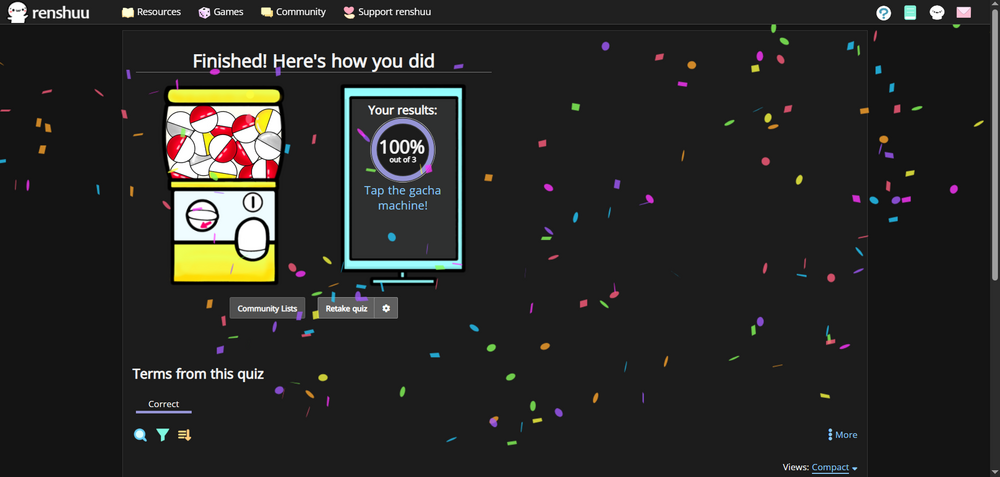
. One thing I would like to request and I thought it would also be a great feature ! When you will finish a quiz with ONLY correct answers (default 40 ), a celebration is bound to happen with a transparent background. Sort of like this
Not too difficult to do, but it requires JS. We can only use CSS for this contest. I made a quick prototype (it's kinda buggy) that fires some confetti from both sides. Just runs on the results page and check what % you got. You can make them bigger/cooler and (probably) in the background. Could be fun as a mod/option in the future.
Hopefully next time we get to use JS. A lot of cool things you can do.
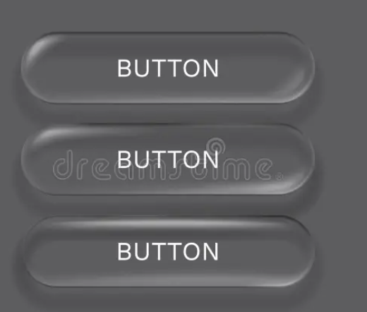
I know it's kind of strange for me to ask, but keeping with the general aesthetic that renshuu already has, I'm wondering if anyone has any takes on a redesigned, standard button for renshuu (like just below at the bottom of this page). I don't want something that clashes with everything else, as I do not have the time for a top-down visual redo, but those boxy buttons are..so..boxy.
No worries , how about making it a little smoother and rounder at the edges like 4px/6px radius instead of 90º. On hover it can maybe increase brightness. But I did see that when you hover, shadow appears which is a less appeared. You can also try to make it transparent
Shadows don't really work with renshuu, which utilizes a relatively "flat" layout. I did try just throwing on a border radius at one point, but it needs someone with a finer touch than me to get it looking good.
I am very much not a designer, but here's one idea. Some border radius and a border style. I think you can make them at least slightly less boxy. Maybe a bit more toned down than this. You can do a lot of cool things with on hover, but that doesn't matter much for mobile.


 , how about making it a little smoother and rounder at the edges like 4px/6px radius instead of 90º.