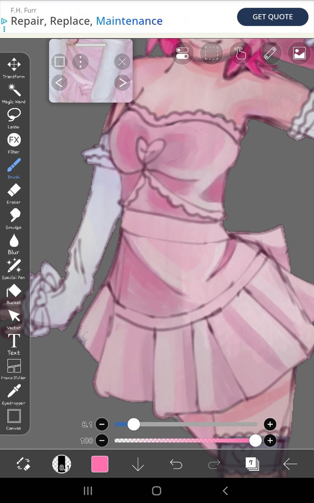
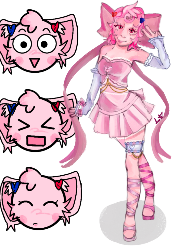
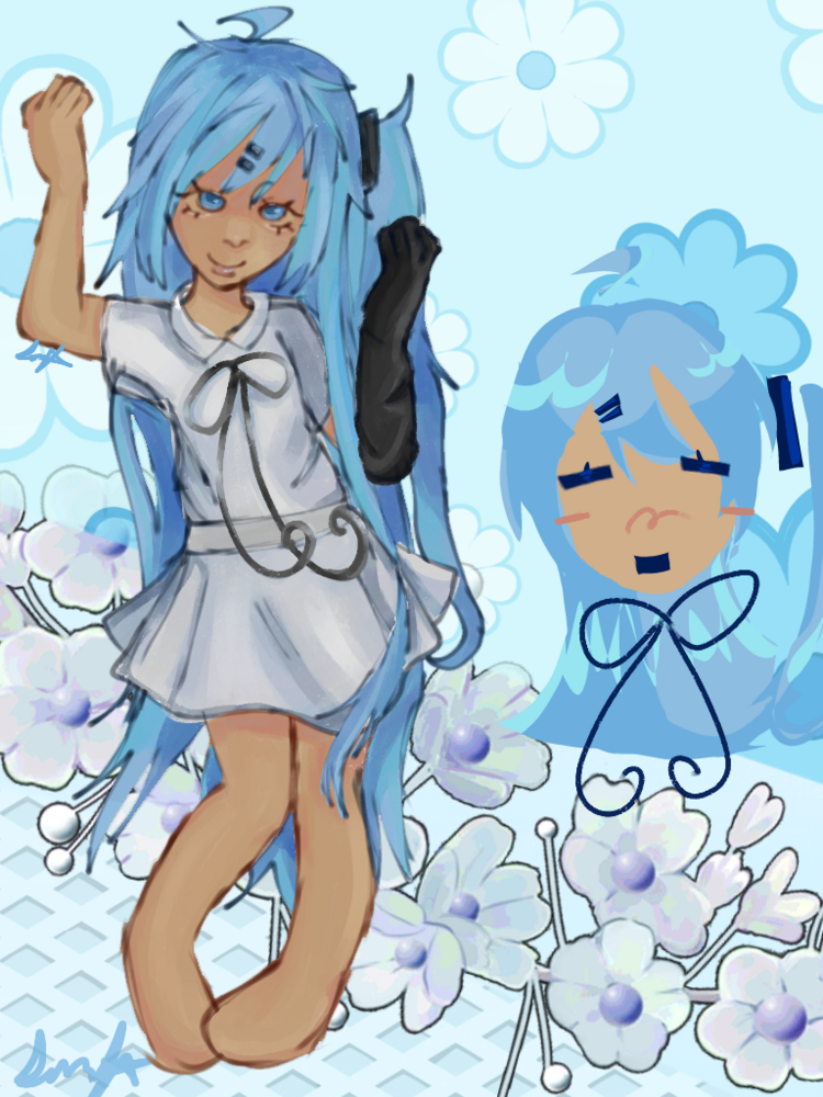
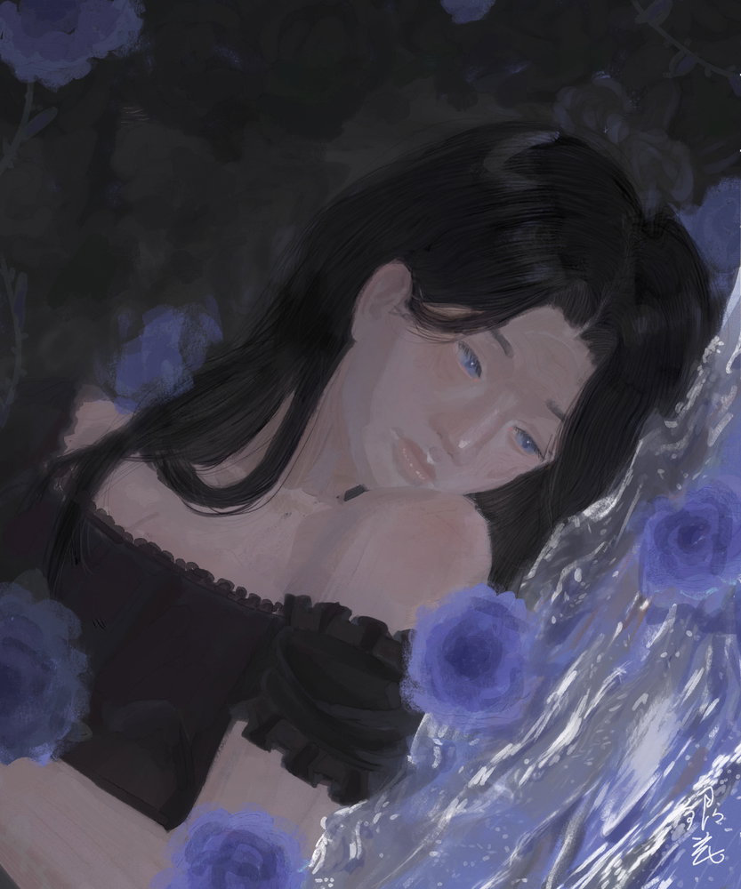
The folds look great! I'm a bit late, but if you want things more colourful, one good way to do that is with hidden colours. Hidden colours, as I would describe them (I can't find any website to back me up here, so do as you will with this information), are colours that you can't see when it's in greyscale. This could mean adding blue in the shadows in a value that is similar to the pink, despite the different hues. That's the basic colour usually used, because it is typically the ambient light because the sky is blue. But you can add bounce light this way as well, if you wanted to add colour without making anything lighter or darker. This one allows for many different colour ideas, but it requires a bit more of imagination to find colours you like, since there isn't a specific rule.
You could also add saturation between shadow and light, which is usually known as sub surface scattering. In real life, from my understanding, it should only occur in semi-transparent items when light hits what is under or in the object. For skin, it would hit just under the skin, where the blood is, creating a saturated reddish line. In art, you can add it to other parts of the art as a stylistic choice if you want, without needing to worry on realism.
If you want more saturated colours, you could take some of the previous mentioned colours, along with the colours already on the piece, and exaggerate the colours in saturation and hue, making the object very vibrant. However, if you do that then the object may stand out, especially compared to the skin and background, which are both a lot less saturated. This one would be a better principal for full illustrations rather than one part of a piece, but I included it as it does add more colours. I haven't explained this the best, but that should be the general idea.
A fourth idea would be adding contrasting cool and warm tones in light and shadow. The idea is that when an object is in warm light, the shadow would be cooler toned. The specific colour can vary based on your ideas and what looks best, and isn't always going to be true, especially with bounce and ambient lighting. It goes the other way too, if the object is in cooler light, the shadow would be warmer toned. This contrast can look lovely, but out of place depending on how it's used. I believe it's best for a neutral environment, as the colours in the surrounding area change the colours.
You could also go for an extra light. That's where a secondary, either weaker or just as bright, light is present, but from a different angle. It could either be a different hue, or the same, but for colour variation, a different colour would be best. You could position them in opposite sides, so where a shadow from the first light appears, the light from the other may hit. This one, however, is a lot trickier, and you may want to give it a study first before trying it. It would also require a different lighting scenario, so I also wouldn't recommend this one for just one object in a piece.
I think I write too much 
I hope this helped someone in some way, because I spend way too much time on these. I usually have a source I use to confirm my information... but I didn't for the first one.
I looked it up, but there wasn't anything there, but I remember it from earlier when I began art, so I'm not sure. Forgive me if anything was wrong.



 Sorry, I don’t know the names
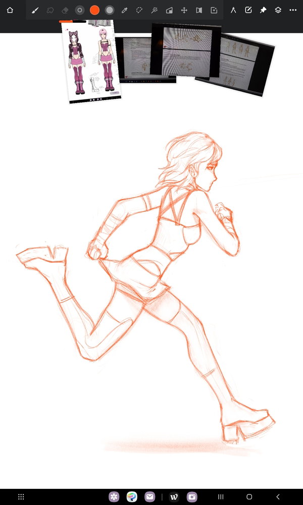
 I have trouble with drawing pleated skirts so I should've used a reference-! But it will definitely keep this in mind, thank you so much for the feedback!!`:D