Vocabulary dictionary

Kanji dictionary

Grammar dictionary

Sentence lookup

test
 

Forums - A safe place for artists

Top > 会話 / General discussion > General Discussion

Page: 117 of 117


avatar
Level: 90

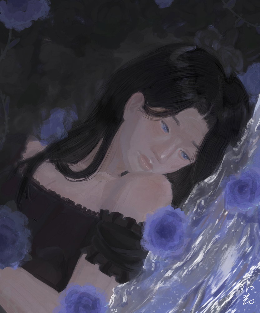
I also recently made a drawingkao_great.png

I have been looking at more realistic shadows and lighting, especially on the face. I like drawing water, especially flowing water. I also discovered using the brush on lower opacity made the hair strands blend in a lot better, so that was nice

9bc958d9131feb73cdfd384b.jpg
3
8 days ago
avatar
(0717, 22:09)
Those poses are very pretty and charming! I like the hands too, they look nice, especially the one on the left of the drawing kao_heart.png Sorry, I don’t know the names kao_dejected.png

On the skirts, I think they are pleated, if they are, then for pleated skirts, there is a waistband at the top which the folded fabric are all connected to. Depending on whether it’s smooth or fabric bunched up on the elastic will change how you draw that part, or it may be a kind with a zipper on the side as well. There are a lot of types of pleated skirts.

If it is a box pleat, accordion pleat or something similar, it would connect up to the waist band, so you’d see it running up to the waistband.
If it’s a top stitched pleat, the top part near the waist is stitched together, which can look like a line from the top to the triangle shadow or gap created underneath.

Of course, it depends on what you’re drawing and choose to highlight, but it can help to possibly make the triangle or lines for the pleats run higher up? I’m sorry for such a long response, I don’t like telling people to do things without an explanation, so they can choose whether it applies or notkao_don.png Let me know if anything was wrong or missing anything important, and I’ll change it!

Your completely right!! kao_shiawase.png I have trouble with drawing pleated skirts so I should've used a reference-! But it will definitely keep this in mind, thank you so much for the feedback!!`:D

3
7 days ago
avatar
Rickyyyy145
Level: 139

btw this forum is gonna be longer than the "wait a minute" forum lolllllllkao_shock.png

also Ive seen a lot of ur guys art and it's super good,keep up the good work kao_yea.png

6
4 days ago
avatar
Rickyyyy145 (0722, 9:17)
btw this forum is gonna be longer than the "wait a minute" forum lolllllllkao_shock.png also Ive seen a lot of ur guys art and it's super good,keep up the good work kao_yea.png

what was the "wait a minute" forum??

4
4 days ago
avatar
Inkheart
Level: 523

A veeeeeery old thread that ended up with 574 pages and had to be shut down kao_dead.png

4
4 days ago
avatar
Rickyyyy145
Level: 139
Inkheart (0723, 2:51)
A veeeeeery old thread that ended up with 574 pages and had to be shut down kao_dead.png

​and had 5 parts ( I think?)

3
3 days ago
avatar
8a870aa924c39f6f1d21b7d6.jpg

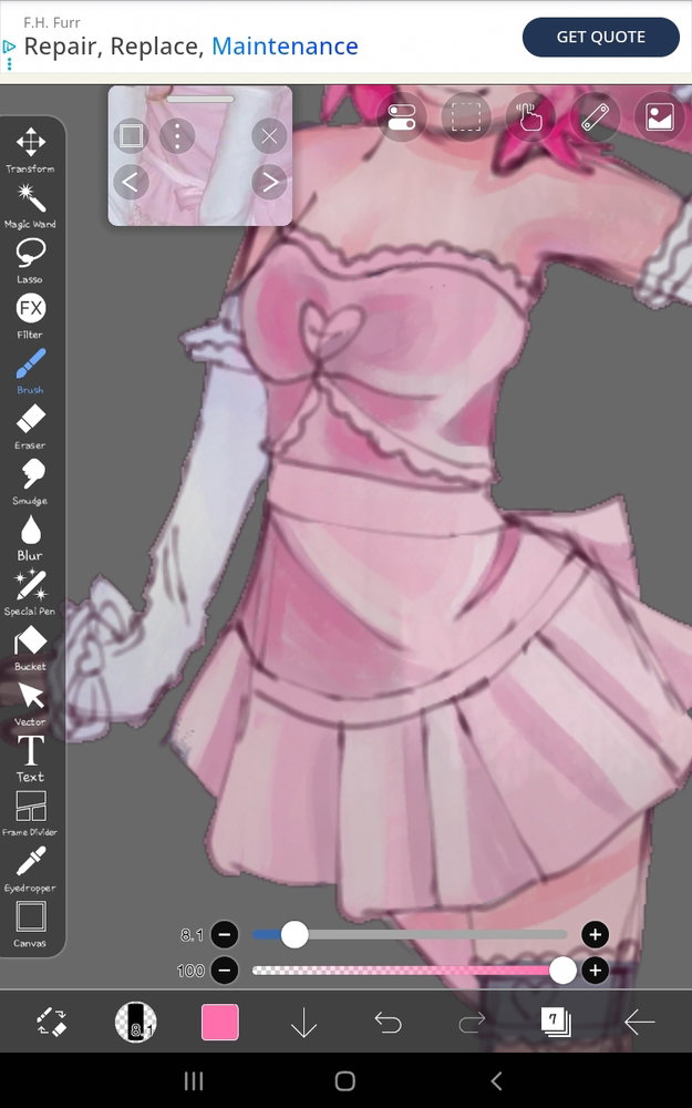
does anyone have any tips to make it look more colorful? (The dress) and do the folds look good?

5
3 days ago
avatar

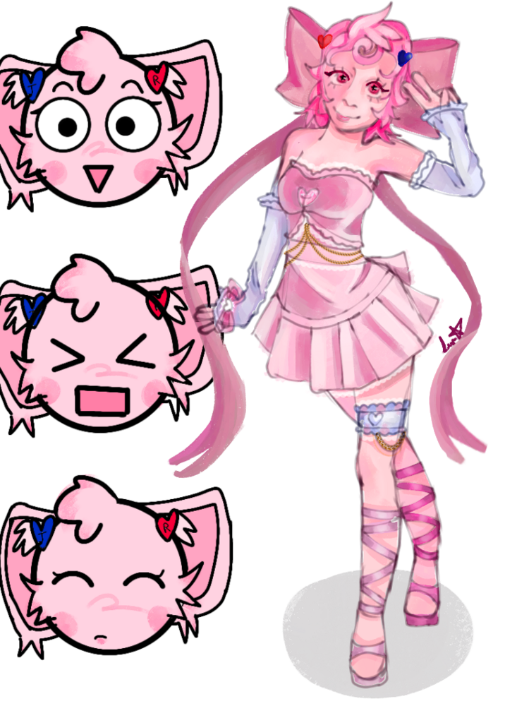
Ok here's the full piece!!

9a3c18f3396129a33f6ab28d.png
2
3 days ago
avatar
Inkheart
Level: 523

The rendering looks so good!! You did a great job kao_heart.png

2
3 days ago
avatar
Level: 90

The folds look great! I'm a bit late, but if you want things more colourful, one good way to do that is with hidden colours. Hidden colours, as I would describe them (I can't find any website to back me up here, so do as you will with this information), are colours that you can't see when it's in greyscale. This could mean adding blue in the shadows in a value that is similar to the pink, despite the different hues. That's the basic colour usually used, because it is typically the ambient light because the sky is blue. But you can add bounce light this way as well, if you wanted to add colour without making anything lighter or darker. This one allows for many different colour ideas, but it requires a bit more of imagination to find colours you like, since there isn't a specific rule.


You could also add saturation between shadow and light, which is usually known as sub surface scattering. In real life, from my understanding, it should only occur in semi-transparent items when light hits what is under or in the object. For skin, it would hit just under the skin, where the blood is, creating a saturated reddish line. In art, you can add it to other parts of the art as a stylistic choice if you want, without needing to worry on realism.


If you want more saturated colours, you could take some of the previous mentioned colours, along with the colours already on the piece, and exaggerate the colours in saturation and hue, making the object very vibrant. However, if you do that then the object may stand out, especially compared to the skin and background, which are both a lot less saturated. This one would be a better principal for full illustrations rather than one part of a piece, but I included it as it does add more colours. I haven't explained this the best, but that should be the general idea.


A fourth idea would be adding contrasting cool and warm tones in light and shadow. The idea is that when an object is in warm light, the shadow would be cooler toned. The specific colour can vary based on your ideas and what looks best, and isn't always going to be true, especially with bounce and ambient lighting. It goes the other way too, if the object is in cooler light, the shadow would be warmer toned. This contrast can look lovely, but out of place depending on how it's used. I believe it's best for a neutral environment, as the colours in the surrounding area change the colours.


You could also go for an extra light. That's where a secondary, either weaker or just as bright, light is present, but from a different angle. It could either be a different hue, or the same, but for colour variation, a different colour would be best. You could position them in opposite sides, so where a shadow from the first light appears, the light from the other may hit. This one, however, is a lot trickier, and you may want to give it a study first before trying it. It would also require a different lighting scenario, so I also wouldn't recommend this one for just one object in a piece.


I think I write too much kao_don.png

I hope this helped someone in some way, because I spend way too much time on these. I usually have a source I use to confirm my information... but I didn't for the first one.kao_worry.png

I looked it up, but there wasn't anything there, but I remember it from earlier when I began art, so I'm not sure. Forgive me if anything was wrong.

4
3 days ago
avatar

there are a few tutorials on YouTube that I would recommend aswell, such as even just looking at orb's (artist) artworks which are all very colorful. I don't exactly remember the names of the videos but if you are interested I can get the titles for you kao_guts.png

2
3 days ago
avatar

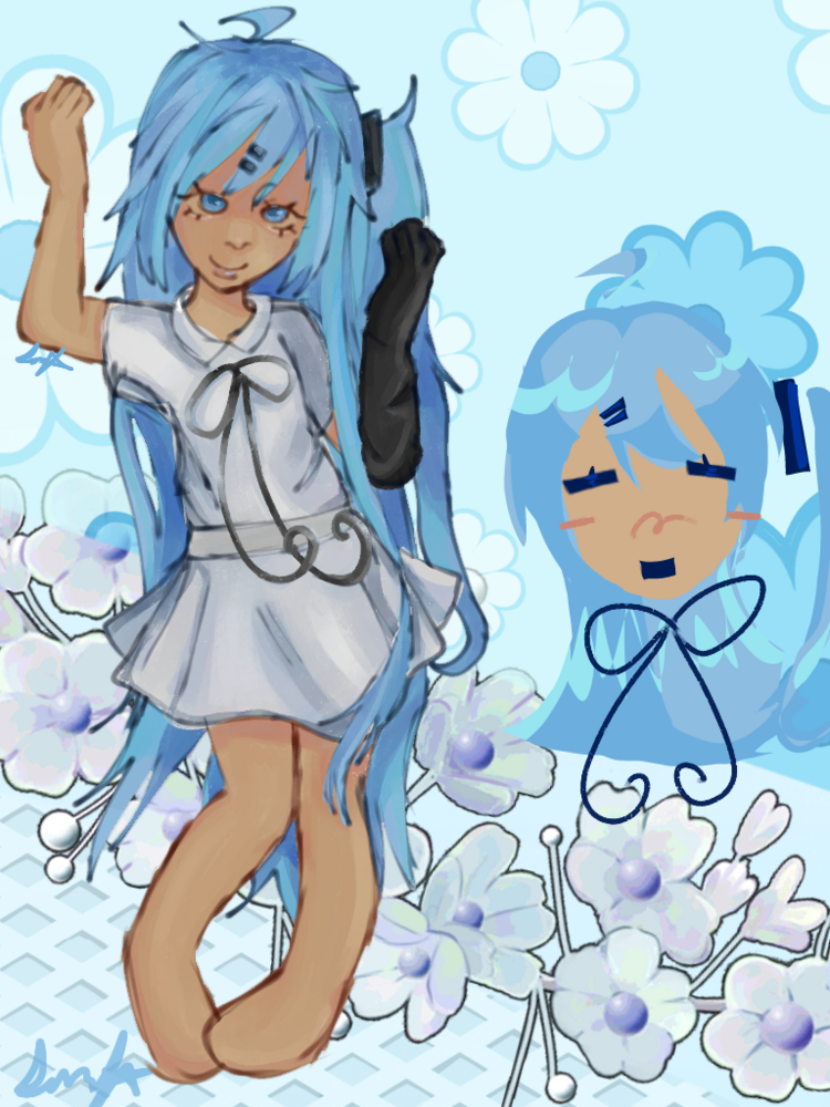
Thank you two for your tips!! I will try to keep them in mind when drawing my other pieces!! Speaking of other pieces I have yet another piece... (I'm very bored and have nothing to do so in return I make lot of art!! kao_shiawase.png)

8530142a888a4ed7ad585b3f.png
5
1 day ago
avatar
Inkheart
Level: 523

Oo, love it! Also, a little late, but using an Overlay layer on top of your colors can really make them pop. I usually clip it onto the color layer below, airbrush a bright color that goes well with the piece, and lower the opacity so it's barely visible :D

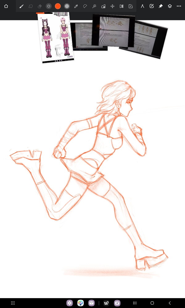
Alsooo, I've got a cool little sketch I might as well share. My csp trial ran out so that Rujinu piece is going to be on hold for a while kao_cry.png

390148de80a54d1bac01c417.jpg

I'm also working on a three-year-gap Bakugo redraw but I'm debating whether or not it's postable content XD Working on my anatomy skills kao_fire.png

Also, fun fact: I ran a few laps around the house to figure out how to draw that pose kao_shiawase.png

5
1 day ago
Getting the posts


Page: 117 of 117


Top > 会話 / General discussion > General Discussion


Loading the list
Lv.

Sorry, there was an error on renshuu! If it's OK, please describe what you were doing. This will help us fix the issue.

Characters to show:


Use your mouse or finger to write characters in the box.
■ Katakana ■ Hiragana