Inkheart (06月23日, 18:57)
...Well, it started out as a simple card idea and ended up as one of the best inked pieces I've ever done I could be happier with the "Happy," but there's no turning back now
I lowkey see a missed opportunity to make the Lil horn of the mask a replacement for the a
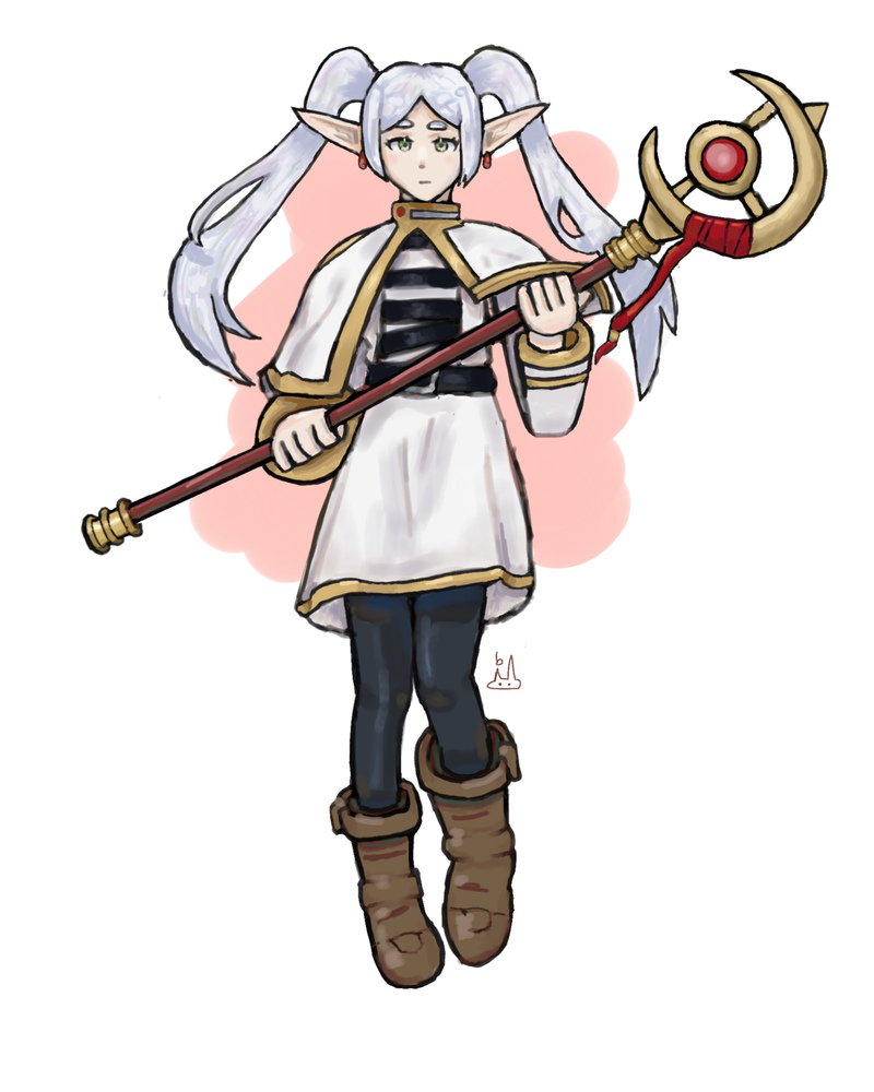
guys!! this is a test drawing I did because I haven't made art in a *long* time. No glaze, I just want to hear your honest opinions on whether this is good or not, and where I can improve. Thanks
(and don't mind the background.. I don't feel like spending another 3 hours on this lol)
Well, she’s instantly recognizable, so plus for that. Nice work on the fabric drape in the cape and skirt. Ideally, you would have some of that in the sleeves and boots as well. Good shading on the legs, especially below the knee.
I think that your next drawing should focus on getting the proportions exactly right. It’s hard for me to judge in this drawing which features were exaggerated deliberately and which just wound up that way.
Well, she’s instantly recognizable, so plus for that. Nice work on the fabric drape in the cape and skirt. Ideally, you would have some of that in the sleeves and boots as well. Good shading on the legs, especially below the knee.
I think that your next drawing should focus on getting the proportions exactly right. It’s hard for me to judge in this drawing which features were exaggerated deliberately and which just wound up that way.
thank you so much for taking the time to point all of that out! I'll definitely work on the things you mentioned
The rendering is REALLY AMAZING!!! And I love the pose you chose I think the things I would recommend improving is...
The hands!! (I struggle with hands too) using a reference of someone holding a staff or something like that might help!
More detailing in the hair!!adding a few more loose strands could definitely enhance the pose
adding darker shadows in the shadows!! I dont know if this is necessary but maybe adding darker shadows into the corners of already existing shadows could enhance the shading!!
Adding some blue (ambient lighting)!! Airbrushing some light blue into the center or tips of the shadows for the white parts of her clothes to add more colors and keep it from looking to gray
Your art skill is way beyond mine so I really don't have anything else to say!!
The rendering is REALLY AMAZING!!! And I love the pose you chose I think the things I would recommend improving is...
The hands!! (I struggle with hands too) using a reference of someone holding a staff or something like that might help!
More detailing in the hair!!adding a few more loose strands could definitely enhance the pose
adding darker shadows in the shadows!! I dont know if this is necessary but maybe adding darker shadows into the corners of already existing shadows could enhance the shading!!
Adding some blue (ambient lighting)!! Airbrushing some light blue into the center or tips of the shadows for the white parts of her clothes to add more colors and keep it from looking to gray
Your art skill is way beyond mine so I really don't have anything else to say!!
Thank you so much for all of the tips!! I will keep that all in mind
I would like to add that ambient lighting doesn’t need to be blue, it depends on the environment! Especially the sky, which is why in most cases the ambient light is blue. It occurs because the diffused lighting is a lot less intense, and more evenly spread out, than the main lighting, so while it doesn’t make it much lighter, it can change the color!
On the topic, bounce light is created when the light bounces from an object and hits the shadow, which can lighten or change the color of the shadow. This is true for things like light colors next to skin (lightens the skin shadow), a light object next to another light object (you can see it in paper, it should lighten the shadow), or even skin next to skin (adding saturation or lightness in the shadow) creating the difference in color for the shadows
If you aren’t sure how to use them though, you don’t need to force yourself to apply it if you aren’t quite sure yet, just take your time and learn new things. I hope that helps, even if it wasn’t exactly new advice. If any of this isn’t true or I’m missing anything, please feel free to correct me!
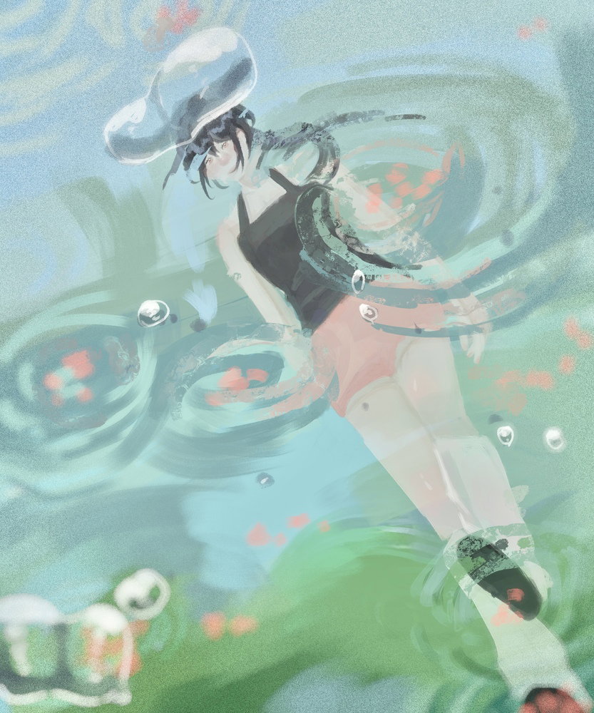
Anyway, I made an artwork recently. I’ve been dissatisfied with my compositions recently, so decided to go for a more expressive “camera” angle, which is under the water!
I would like to add that ambient lighting doesn’t need to be blue, it depends on the environment! Especially the sky, which is why in most cases the ambient light is blue. It occurs because the diffused lighting is a lot less intense, and more evenly spread out, than the main lighting, so while it doesn’t make it much lighter, it can change the color!
On the topic, bounce light is created when the light bounces from an object and hits the shadow, which can lighten or change the color of the shadow. This is true for things like light colors next to skin (lightens the skin shadow), a light object next to another light object (you can see it in paper, it should lighten the shadow), or even skin next to skin (adding saturation or lightness in the shadow) creating the difference in color for the shadows
If you aren’t sure how to use them though, you don’t need to force yourself to apply it if you aren’t quite sure yet, just take your time and learn new things. I hope that helps, even if it wasn’t exactly new advice. If any of this isn’t true or I’m missing anything, please feel free to correct me!
Anyway, I made an artwork recently. I’ve been dissatisfied with my compositions recently, so decided to go for a more expressive “camera” angle, which is under the water!
those were some great art tips you just gave us! And on the topic of the drawing you posted along with them, the idea of the camera being underwater is really cool! I would just add that the next time you do something like that, you make the proportions of the person above water more warped and the shading/lighting of the entire piece more dramatic to really emphasize the idea. It's really helpful to have lots of reference photos taken underwater to show you what it would look like.
Good Tip sanitizer! But also correct me if I'm wrong yinhua, I think the girl is actually stepping on top of the water
so she's not in it, but still maybe that still means it should be warped and/or a bit blurry near the moving parts of water to capture the feeling of the viewer being in the water below!
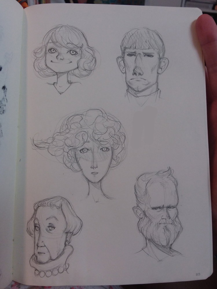
Here's a lil caricature sheet that I worked on during an online art lecture! It was only an hour total so I had to work faster than usual but it was a good workout and I really like the result
I would love to know which one is your favorite
Also this is random but today I saw a girl in the CUTEST outfit for Cow Appreciation Day at Chik-fil-A so you might see a drawing of her in a bit
Inkheart (07月14日, 19:17)
Here's a lil caricature sheet that I worked on during an online art lecture! It was only an hour total so I had to work faster than usual but it was a good workout and I really like the result
I would love to know which one is your favorite Also this is random but today I saw a girl in the CUTEST outfit for Cow Appreciation Day at Chik-fil-A so you might see a drawing of her in a bit
I really like the way you drew the old lady in the bottom left!!
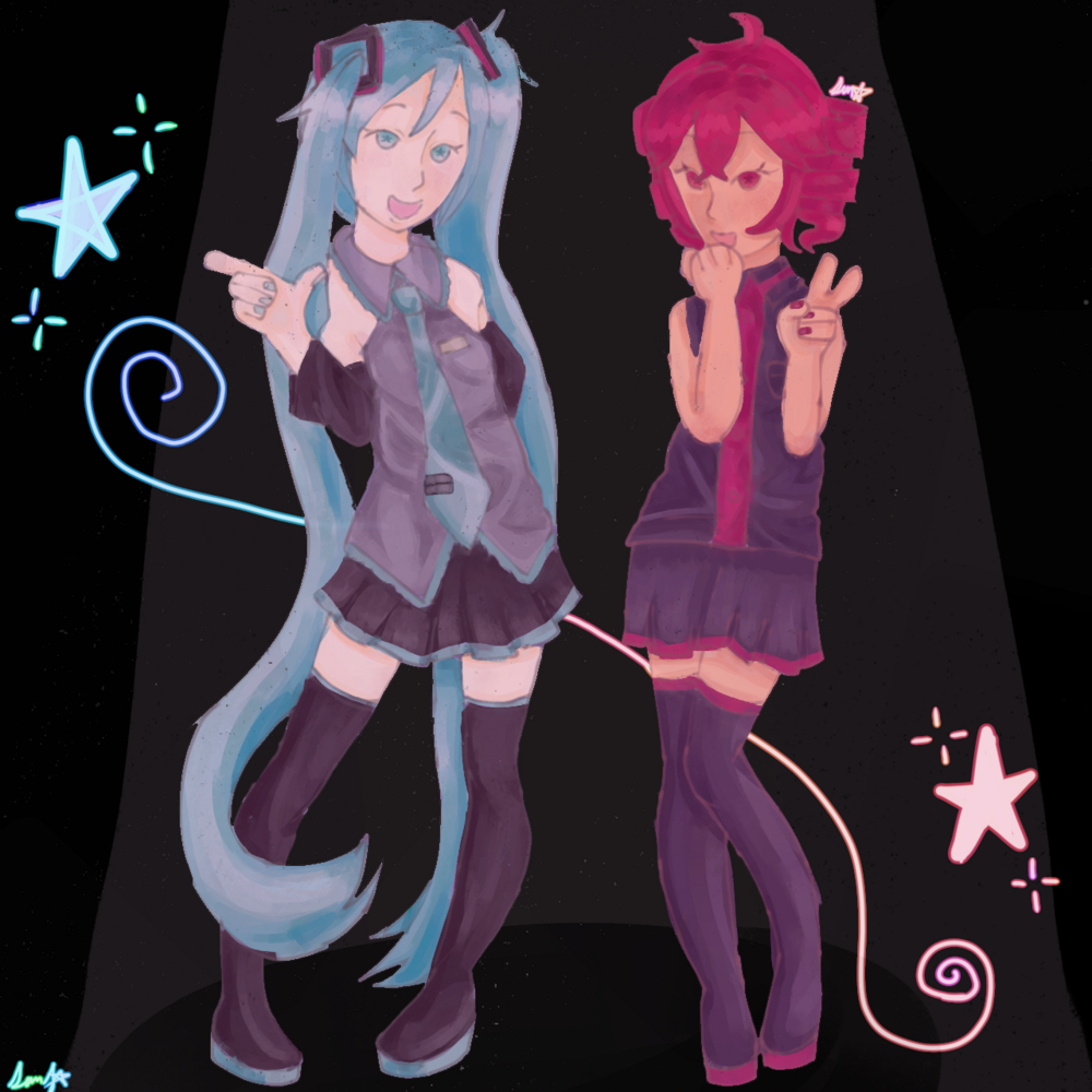
Those poses are very pretty and charming! I like the hands too, they look nice, especially the one on the left of the drawing
Sorry, I don’t know the names
On the skirts, I think they are pleated, if they are, then for pleated skirts, there is a waistband at the top which the folded fabric are all connected to. Depending on whether it’s smooth or fabric bunched up on the elastic will change how you draw that part, or it may be a kind with a zipper on the side as well. There are a lot of types of pleated skirts.
If it is a box pleat, accordion pleat or something similar, it would connect up to the waist band, so you’d see it running up to the waistband. If it’s a top stitched pleat, the top part near the waist is stitched together, which can look like a line from the top to the triangle shadow or gap created underneath.
Of course, it depends on what you’re drawing and choose to highlight, but it can help to possibly make the triangle or lines for the pleats run higher up? I’m sorry for such a long response, I don’t like telling people to do things without an explanation, so they can choose whether it applies or not Let me know if anything was wrong or missing anything important, and I’ll change it!


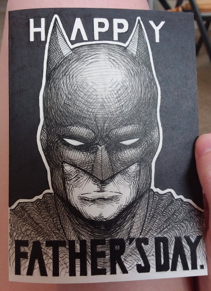 I could be happier with the "Happy," but there's no turning back now

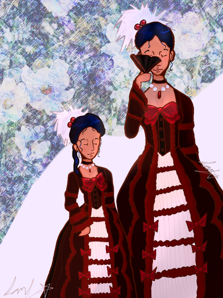

 also I love the outfit of mericelle! Especially the color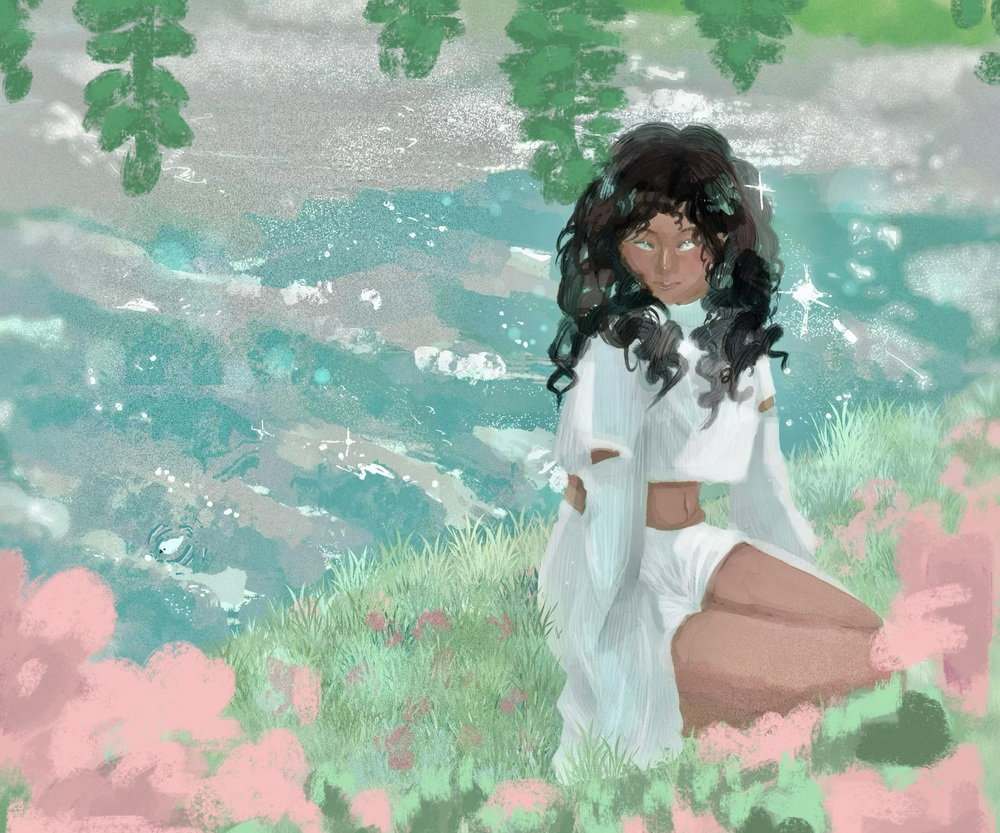

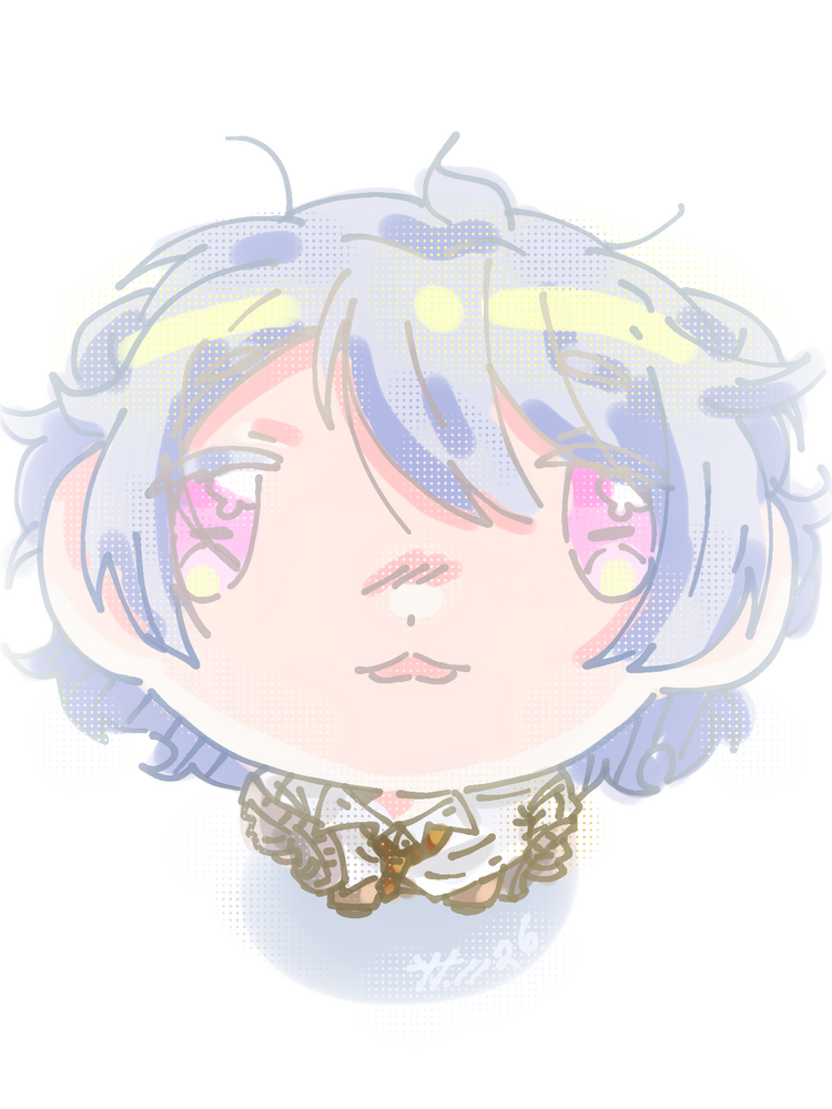
 Towa otonashi (my favorite character from the game
 )
) so here's some fanart of Jax (that my friend requested lol!!)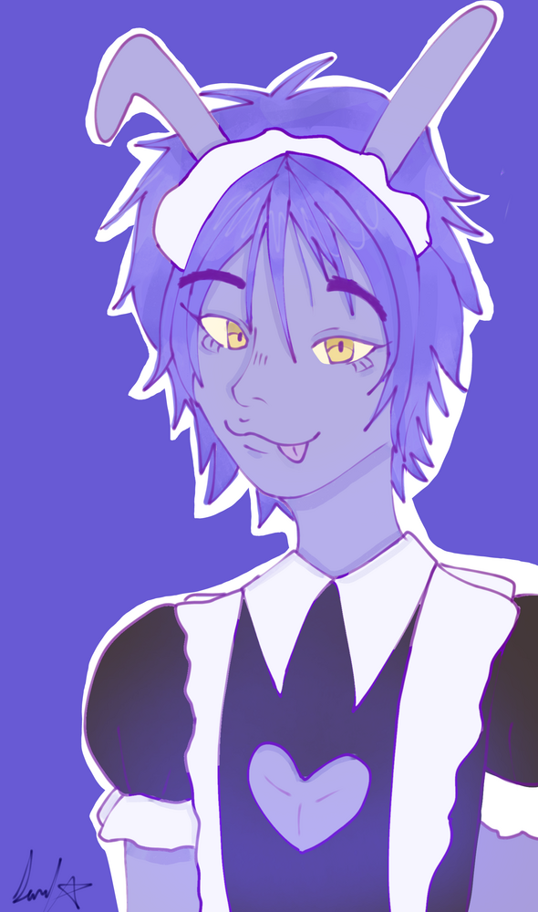









 Let me know if anything was wrong or missing anything important, and I’ll change it!